
Manhattan Real Estate | < 1 minute read
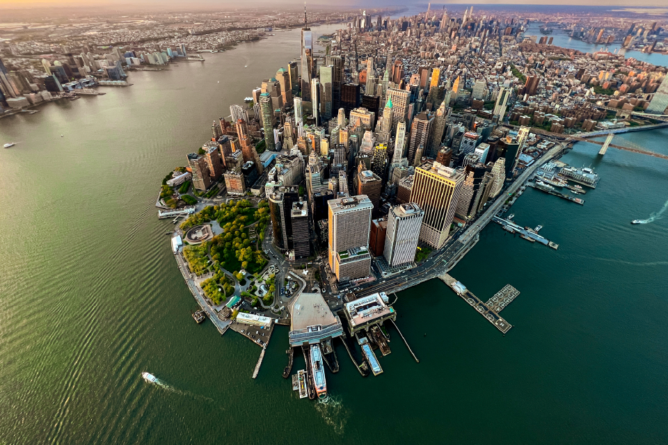
Q4 2011 Manhattan Apartment Sales Map
BY PropertyShark Staff | Jan 6, 2012
The fourth quarter of 2011 has ended, so our interactive apartment sales map is ready to show which parts of Manhattan had the highest density of sales and where the priciest sales were.
To better visualize it, on the map, the number of sales by building is depicted by the size of the circle while the color indicates the price per square foot. You can click on the dots to see more details about sold units in the buildings you’re interested in.

ththt
Click on the following link to browse current Manhattan apartments for sale.
Latest Posts
Want to stay on top of the real estate market?
Access comprehensive property data and ownership information with intuitive research tools.
POSTED IN: Manhattan Real Estate

Recent Reports

2026 Q2 Foreclosure Report: Bronx Caseload Hits 7-Year High, Brooklyn & Manhattan Slow to 4-Year Low
Manhattan yet again slowed to become the city’s least active foreclosure market, Brooklyn’s caseload dropped so low it barely edged out Staten Island, while the Bronx heated up enough to surpass all boroughs except Queens.
NYC Resale Gains & Losses: Every Borough Made Money in 2025, Except Manhattan
In 2025, NYC home-sellers mostly made money. But, in Manhattan, resales came with losses — and it was apartments and recent buyers that absorbed them.
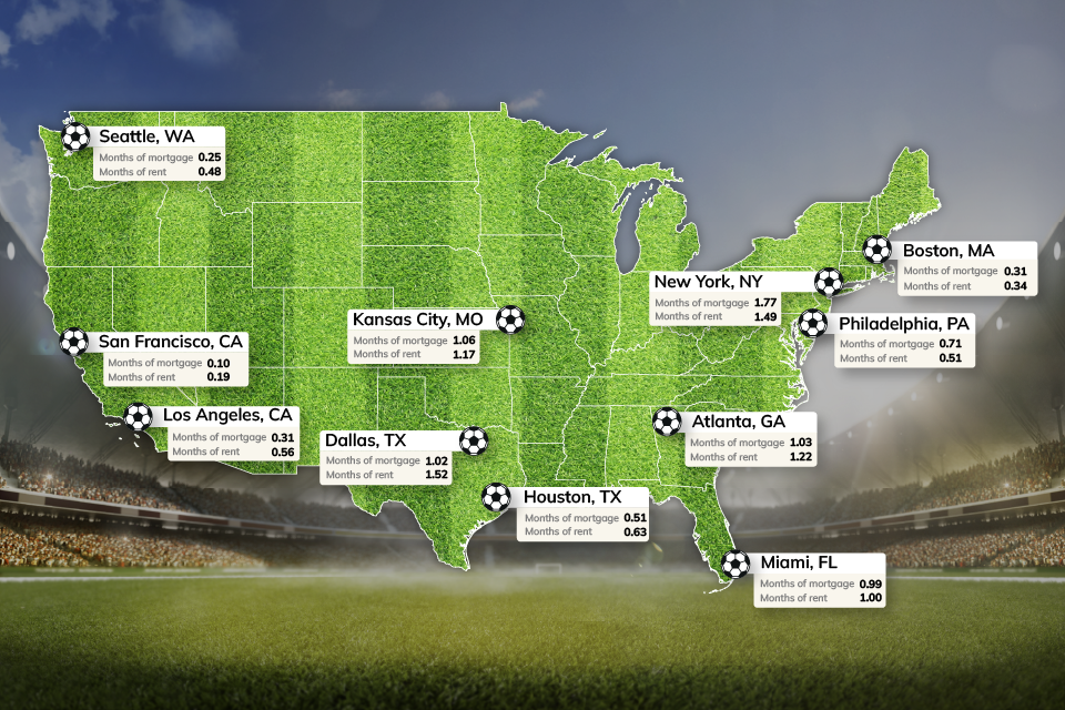
World Cup or Your Mortgage/Rent? Ticket Prices Rival Host City Housing Costs
World Cup ticket prices rival monthly housing expenses in the 11 U.S. host cities, with even the cheapest seats covering weeks or even months of rent or mortgage payments.