

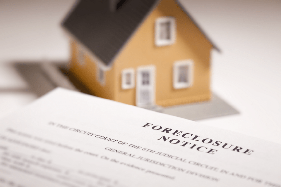
How to Find Foreclosed Homes Step-by-Step Using PropertyShark
By Laura Pop-Badiu |

NYC Resale Gains & Losses: Every Borough Made Money in 2025, Except Manhattan
By Eliza Theiss |

NYC Business Leaders on RTO: Survey Reveals Hybrid Still Dominates, Office Attendance Set to Rise
By Laura Pop-Badiu |
How to Find Foreclosed Homes Step-by-Step Using PropertyShark
To help real estate professionals find foreclosed homes in a timely and efficient manner, this guide breaks down every step of the research process — from understanding foreclosure status all the way to finding contact information for owners and looking past LLCs.
NYC Resale Gains & Losses: Every Borough Made Money in 2025, Except Manhattan
In 2025, NYC home-sellers mostly made money. But, in Manhattan, resales came with losses — and it was apartments and recent buyers that absorbed them.

NYC Business Leaders on RTO: Survey Reveals Hybrid Still Dominates, Office Attendance Set to Rise
Hubble’s recent survey of 126 founders, CEOs and other decision-makers in New York City’s startup ecosystem revealed how local business leaders are approaching workplace strategy in 2026 and beyond.

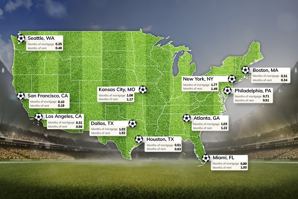
World Cup or Your Mortgage/Rent? Ticket Prices Rival Host City Housing Costs
World Cup ticket prices rival monthly housing expenses in the 11 U.S. host cities, with even the cheapest seats covering weeks or even months of rent or mortgage payments.
NYC Office Market Ahead of National Curve: Manhattan Q1 Vacancy Drops to 13.1%
New York City’s office market outpaced the U.S. on several major metrics in Q1, with Manhattan vacancy nearly 5 percentage points below the national benchmark, asking rents climbing against a downward national trend and flex inventory crossing 15 million square feet.

How to Find Land Boundaries: Free & Paid Methods
If you need to find land boundaries fast, you can start with a free county parcel/GIS viewer or a premium platform like PropertyShark to see an approximate parcel outline and lot data. However, keep in mind that a web-based land boundaries map is a starting point, not the legal finish line.

Locked-In Owners, Mobile Renters: Homeowners Stay Put as Renters Move 3.7x More Across Largest U.S. Cities
Renters became the primary drivers of long-distance mobility across the largest U.S. cities, moving 3.7 times more than owners in 2024, as high mortgage rates and housing costs kept many homeowners in place.

$4.6M Hudson Yards Maintains Top Spot, Luxury Sales in Malba Set $2.5M Price Record for Queens
Despite prices declining, Hudson Yards remained the most expensive NYC neighborhood, but TriBeCa’s growth closed the gap to under $400,000, while Malba set a new historic price record for Queens at $2.5 million, securing the highest ranking ever for the borough at #5.

2026 Q1 Foreclosure Report: Brooklyn Filings Fall Sharply, Bronx & Staten Island Hit New Peaks
Behind a deceptively mild citywide downtick, borough foreclosure markets pulled into significantly diverging paths as Brooklyn cases were nearly halved and the Bronx hit a new, record high. Meanwhile, Queens remained unchanged, Staten Island surged back up and Manhattan cooled slowly.

How to Do a Title Search on Property Yourself: A Step-by-Step Online Guide
A property title search is the process of reviewing public records to confirm who legally owns a property and whether there are any liens, mortgages or legal claims attached to it. Explore our step-by-step guide explaining how you can perform a title search yourself.

New York Real Estate
NYC Resale Gains & Losses: Every Borough Made Money in 2025, Except Manhattan
In 2025, NYC home-sellers mostly made money. But, in Manhattan, resales came with losses — and it was apartments and recent buyers that absorbed them.


National real estate

World Cup or Your Mortgage/Rent? Ticket Prices Rival Host City Housing Costs
World Cup ticket prices rival monthly housing expenses in the 11 U.S. host cities, with even the cheapest seats covering weeks or even months of rent or mortgage payments.
Read more →
Locked-In Owners, Mobile Renters: Homeowners Stay Put as Renters Move 3.7x More Across Largest U.S. Cities
Renters became the primary drivers of long-distance mobility across the largest U.S. cities, moving 3.7 times more than owners in 2024, as high mortgage rates and housing costs kept many homeowners in place.
Read more →Want to stay on top of the real estate market?
Get weekly sales updates, including buyers, sellers and sales prices, with a PropertyShark subscription.
Real estate guides
How to Find Foreclosed Homes Step-by-Step Using PropertyShark
To help real estate professionals find foreclosed homes in a timely and efficient manner, this guide breaks down every step of the research process — from understanding foreclosure status all the way to finding contact information for owners and looking past LLCs.


All articles
How to Find Foreclosed Homes Step-by-Step Using PropertyShark
To help real estate professionals find foreclosed homes in a timely and efficient manner, this guide breaks down every step of the research process — from understanding foreclosure status all the way to finding contact information for owners and looking past LLCs.
NYC Resale Gains & Losses: Every Borough Made Money in 2025, Except Manhattan
In 2025, NYC home-sellers mostly made money. But, in Manhattan, resales came with losses — and it was apartments and recent buyers that absorbed them.
NYC Business Leaders on RTO: Survey Reveals Hybrid Still Dominates, Office Attendance Set to Rise
Hubble’s recent survey of 126 founders, CEOs and other decision-makers in New York City’s startup ecosystem revealed how local business leaders are approaching workplace strategy in 2026 and beyond.
World Cup or Your Mortgage/Rent? Ticket Prices Rival Host City Housing Costs
World Cup ticket prices rival monthly housing expenses in the 11 U.S. host cities, with even the cheapest seats covering weeks or even months of rent or mortgage payments.
NYC Office Market Ahead of National Curve: Manhattan Q1 Vacancy Drops to 13.1%
New York City’s office market outpaced the U.S. on several major metrics in Q1, with Manhattan vacancy nearly 5 percentage points below the national benchmark, asking rents climbing against a downward national trend and flex inventory crossing 15 million square feet.
How to Find Land Boundaries: Free & Paid Methods
If you need to find land boundaries fast, you can start with a free county parcel/GIS viewer or a premium platform like PropertyShark to see an approximate parcel outline and lot data. However, keep in mind that a web-based land boundaries map is a starting point, not the legal finish line.
Locked-In Owners, Mobile Renters: Homeowners Stay Put as Renters Move 3.7x More Across Largest U.S. Cities
Renters became the primary drivers of long-distance mobility across the largest U.S. cities, moving 3.7 times more than owners in 2024, as high mortgage rates and housing costs kept many homeowners in place.
$4.6M Hudson Yards Maintains Top Spot, Luxury Sales in Malba Set $2.5M Price Record for Queens
Despite prices declining, Hudson Yards remained the most expensive NYC neighborhood, but TriBeCa’s growth closed the gap to under $400,000, while Malba set a new historic price record for Queens at $2.5 million, securing the highest ranking ever for the borough at #5.